Dear Data Binghamton began when Amber Simpson, associate professor and co-assistant director for the Department of Teaching, Learning and Educational Leadership, reached out to the Digital Scholarship team in the Libraries to discuss … something completely different. During that conversation Amber shared her admiration for Girogia Lupi and Stefanie Posavec’s Dear Data project which happened to also be one of Digital Scholarship Librarian Ruth Carpenter’s favorite examples of data visualization projects. The two joined forces bringing in a cohort of faculty and graduate students from across campus to create a plan to engage Binghamton’s campus in a Dear Data inspired project.
In the original Dear Data project, professional data illustrators Lupi and Posavec challenged each other to send each other weekly postcards over the course of a year. Each postcard contained a data visualization with a corresponding key based on a theme that Lupi and Posavec agreed on. Some themes were observational, such as visualizing the number and type of doors they saw each week while others required more personal reflection such as visualizing their laughter in a week or the times they said goodbye. Lupi and Posavec would carefully track data based on that week’s theme and then create a small piece of data artwork visualizing their final data. The result is a blend of art, data and self-reflection.
Dear Data’s blend of creativity, data literacy and self-reflection is what drew Amber and Ruth to the project originally and what makes it a unique learning opportunity. Their main goal in bringing Dear Data to Binghamton was to engage undergraduate students who may otherwise feel intimidated by data or that data was somehow not relevant to them in an activity that made learning about data more approachable and fun. Together with a few other faculty and graduate students, the pair brainstormed a series of activities to bring Dear Data Bing to life including a kick-off event and a series of write-ins where participants could come and create their postcard after gathering their data.
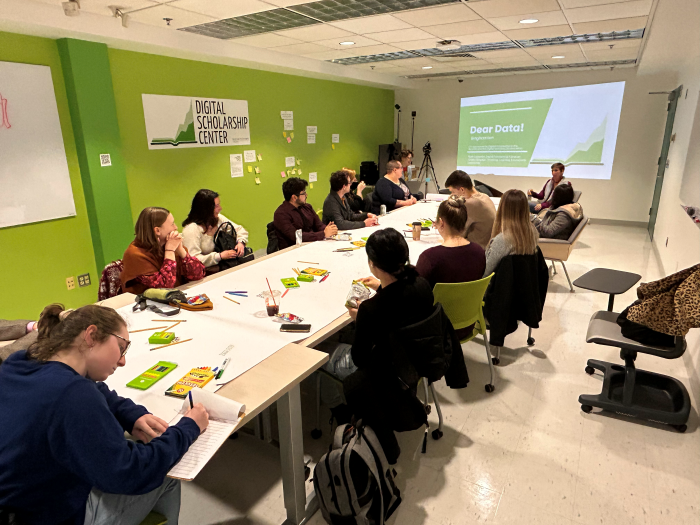
Dear Data Bing was launched in spring 2023 around the theme “A week of social media” that asked participants to keep track of their social media use over the course of a week. The first event the group hosted was a kick-off event that walked participants through a series of creative exercises to teach some of the basic principles of data visualization and design. At the event participants collectively added their visualizations and drawings to a large scroll of paper rolled out over a group of tables. At the kick-off and the subsequent write-ins time was spent engaging students in best practices around data collection, cleaning and organizing data, analyzing data, and turning data into a visualization.
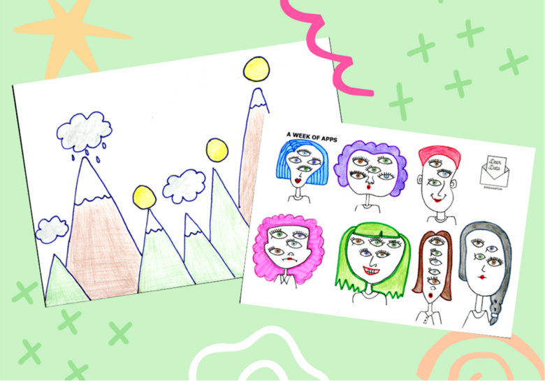
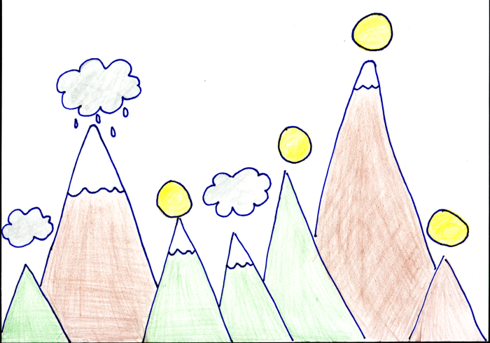
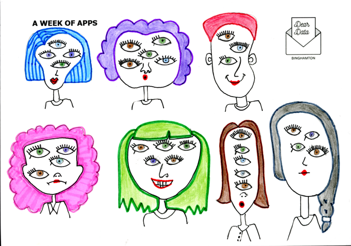
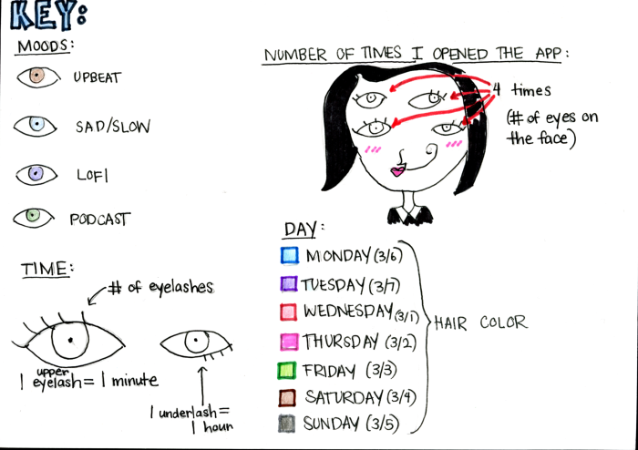
Throughout the semester participants were welcome to create and drop-off postcards in the Libraries. By the end of the spring semester more than 30 postcards were submitted. Some of the postcards more closely resembled more traditional methods, such as timelines and graphs, that might be associated with data visualization, but other participants took a much more creative approach. Postcards were turned in that had a variety of themes and illustrations on them from snow capped mountains, faces with multiple eyes and giraffes. At first, some of these depictions may not look like data immediately, but after reading through the keys on the back of the cards the data behind the illustrations becomes clearer.
Beyond engaging students in a project like Dear Data that encourages building data literacies in a fun and creative way, Dear Data can be an introduction to students to the field of information design and data journalism. Giorgia Lupi recently published an article in the New York Times Data Visualization section about her experience struggling with and diagnosing her long Covid symptoms. The article literally paints Lupi’s data throughout in ways very reminiscent of the Dear Data project. Beyond teaching students the best practices, Dear Data can be a starting point and inspiration for students interested in jobs in data visualization, illustration and journalism or anyone interested in the intersection of design, data and communication.
Dear Data Bing continues this semester! Check out our small exhibit in the Fine Arts area of Bartle Library or drop into one of our write-ins: 2 – 3 p.m. Wednesday, March 27 and 2-3 p.m. Tuesday, April 16 in the pilot Digital Scholarship Center in Science Library room 209.
Dear Data would not have been possible without the help and efforts of those involved in the project including:
- Amber Simpson, associate professor, teaching, learning and educational leadership
- Melissa Haller, co-Director, digital and data studies
- Kirsten Pagan, student engagement specialist, student affairs
- Halie Kerns, digital scholarship librarian
- Mary Tuttle, subject librarian
- Hannah Jones, Ph.D. candidate, Department of History
- Mamen del Carmen Rodriguez Galindo, Ph.D. candidate, Department of English
- Amanda Ortiz, Ph.D. candidate, Department of History